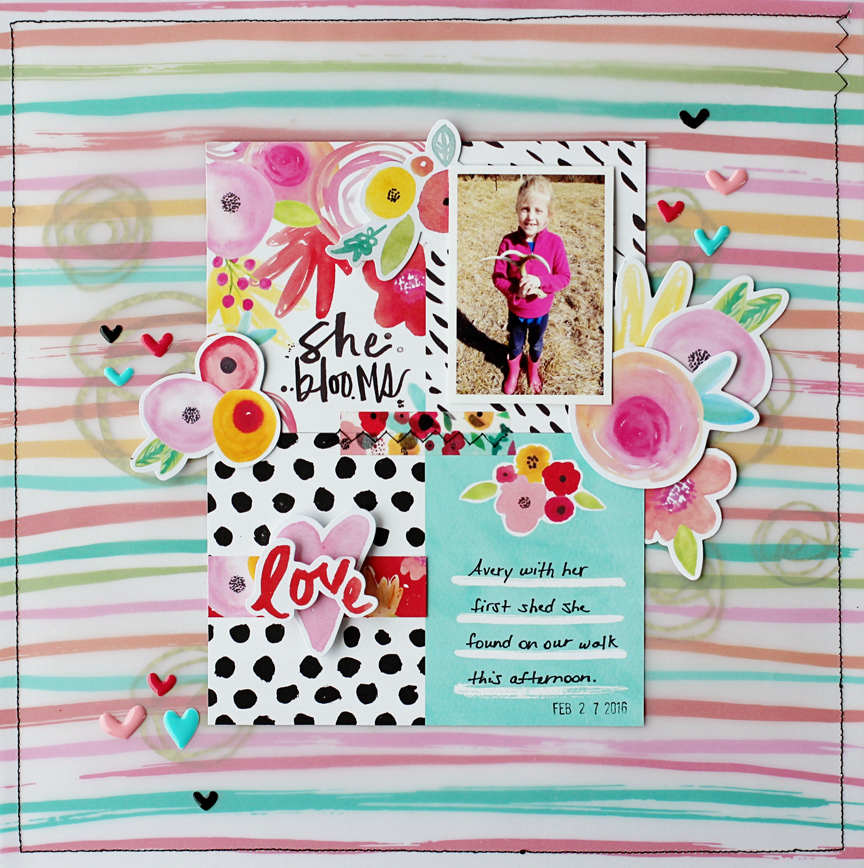
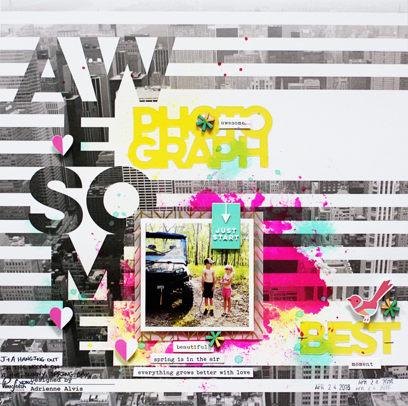
5.25.2016

Turning Triangle Into Circles *Hip Kit Club*

Hi everyone! 

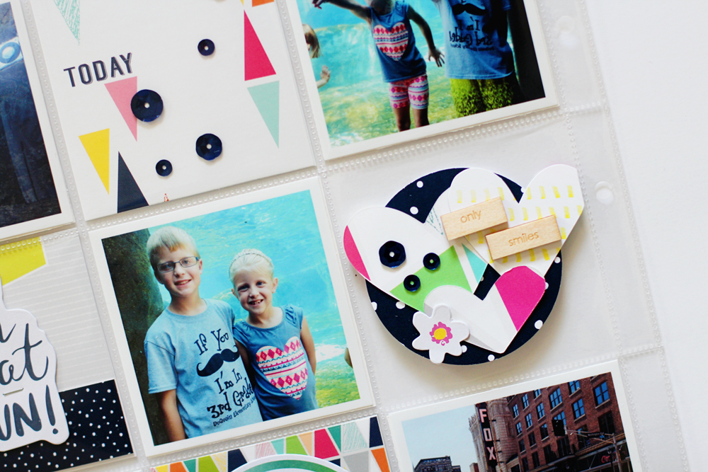
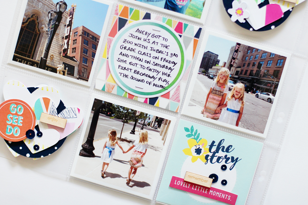
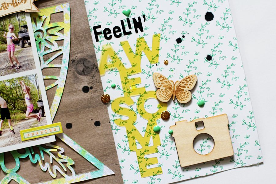
I shared this bright and colorful layout that I created using the May 2016 Hip Kits on the Hip Kit Club blog yesterday! The fun triangle shapes on the Meadowbrook "Lucy In The Sky" HKC exclusive patterned paper was the main inspiration for my page design. I knew right away that I wanted to fussy cut the triangles and arrange them in a circular design on my layout.   


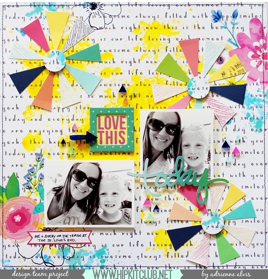
For a bright color effect, I added some yellow spray ink on the background paper "Notes From Home" from the Meadowbrook collection (available in the May 2016 Paper Kit) and then arranged the fussy-cut triangles in large circles around my page leaving some room for my photos near the center of the paper. 


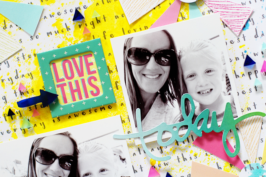
I added the "today" phrase from the Meadowbrook Ephemera pack that's available in the May 2016 Main Kit and layered it at the bottom of one of my photos of my daughter and I riding the train at the zoo. I placed several of the Meadowbrook Triangle Acrylic Shapes (available in the May 2016 Embellishment Kit) around my photos to draw the eye around my layout. I love how the acrylic shapes give my page an added dimension and a fun texture! 


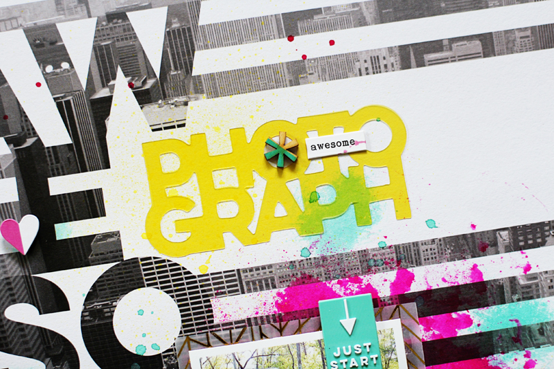
I used one of the HKC exclusive Project Life cards from the May 2016 Project Life Kit and cut it to fit in one of the Simple Stories "Life In Color" Chipboard Frames for my title. The colors of those chipboard frames coordinate so well with the HKC exclusives! 


I hope I've inspired you to use the fun triangular patterned paper from the Meadowbrook Collection in a different way.

Thanks so much for joining me today!

5.23.2016

Bella Blvd Guest Designer!

Hi friends!

I'm so excited to be guest designing at Bella Blvd today! I used some of their very best collections, including "She Blooms", "Cute Baby Boy", and "Let's Go" to create my projects.


I have more detailed photographs of my creations and lots more info about how these pages came together on the Bella Blvd blog so be sure and head over there to check out my full post!


I loved creating with Bella Blvd's amazing products...from enamel hearts to chipboard clouds...they have it all!!! And I really love how well everything coordinated even when I wasn't using the same collection for every detail or embellishment that I added to my projects.


I couldn't help using so many bright and bold colors on my layouts, but I used a lot of aqua accents to help balance my color schemes.


Thanks for stopping by and I hope you have a wonderful day!

5.18.2016

The Best Photobomb! and a Project Life Insert *Hip Kit Club*

Hey everyone!

I shared this layout and a Project Life spread on the Hip Kit Club Facebook page yesterday. I used the May 2016 Hip Kits for both of these projects and I am thrilled with how they turned out! 


For this layout, I used the awesome cut file designed by Ashley Horton (which is free for HKC subscribers!) as the main element of my page design. I used dimensional foam dots to raise the "love" sentiment and layered several of the Meadowlark Ephemera bits and wood veneer pieces from Jillibean Soup (available in the May 2016 Main Kit) around the right side of my page. 


I used one of my favorite photographs of my daughter and her dance team goofing off during their recent recital rehearsal and embellished around it with some fussy cut flowers from one of the HKC exclusive patterned papers designed by the super talented Kim Watson and some Jillibean Soup Self Adhesive Sequins that are available in the May 2016 Embellishment Kit. I backed some of the hearts from the cut file with some coordinating patterned papers from the May Kits and added one of the adorable Cute Clips from Illustrated Faith at the top of my photo. 


For my next project, I created a fun Project Life insert for the month of May showcasing my kiddos' recent St. Louis field trips that all occurred in the same week. I used several of the journaling cards from the May 2016 Project Life Kit and cut them to fit inside of the 3x3 pockets. 


I created a couple of embellishment clusters using the leftover hearts from the cut file in my layout above and added several of the Jillibean Soup Life Wordfetti Wood Veneer sentiments that are also available in the May 2016 Project Life Kit. For my title cards, I used the Rainy Day Letter Stickers from Bella Blvd and mixed the fonts to add visual interest. 


I kept the same design elements on the back side of my insert and continued my bright color scheme with the embellishments that I added.


It certainly was a busy week and I'm so thankful we had great weather for all of our St. Louis adventures! Be sure and grab you May 2016 Hip Kits before they're gone. 

Thanks so much for stopping by and have a great day! 

5.11.2016

Feelin' Awesome! *Hip Kit Club*

Happy Tuesday, everyone!

I shared one last layout that I created using the April 2016 Hip Kits on the Hip Kit Club blog yesterday. I wanted to focus on using some of the lovely wood veneer pieces from  the Simple Stories "Life Color" collection that's available in the April 2016 Embellishment Kit and the My Mind's Eye "My Story" Wood Veneer Shapes that are available in the April 2016 Project Life Kit on this layout. While you can color or alter wood veneer using ink or embossing powder, I chose to leave mine "as is" for my earthy-toned page about my two youngest kiddos getting excited for the last day of school to arrive.
feelinawesome2

I used the large ampersand cut file (available in the April 2016 Downloads) designed by the lovely and talented Kim Watson and cut it out on a piece of white card stock. After I cut out the ampersand, I used the two Shimmerz Coloringz Vibrant Mists from the April 2016 Color Kit to give it more of a mixed media look. I layered the cut file on top of the b-side of the Maggie Holmes "Bloom" Flutter patterned paper from Crate Paper (available in the April 2016 Paper Kit) and placed my photo strip on top, near the middle of my page.

feelinawesome3

I typed my journaling on my computer and placed it under one of the Pinkfresh Studio "Life Noted" Epoxy Stickers (available in the April 2016 Project Life Kit) and layered one of the My Mind's Eye Wood Veneer Stickers at the top of my photo strip. I also added a few of the Shimelle "Star Shine" Phrase and Alphabet Stickers that are also in the April 2016 Project Life Kit around my photo strip as well.

feelinawesome6

I added my title using the Black Mini Alphabet Stickers from Elle's Studio (available in the April 2016 Project Life Kit) and one of the Pinkfresh Studio "Life Noted" Acetate Words that's included in the April 2016 Main Kit. I added a wood veneer butterfly from My Mind's Eye, a camera wood veneer shape from Simple Stories, and a couple of the My Mind's Eye "On Trend 2" Enamel Dots near my title to help draw the eye around my page.

feelinawesome5

I completed my page by sprinkling a little black spray ink around my layout to coordinate with the black letter stickers in my title and to add a little extra pop of color. I just love how well the earthy colors coordinate with the wood veneer elements on this layout! 

Thanks for stopping by and I hope you have a wonderful day!

Adrienne Alvis Graphic

5.09.2016

NSD Cut File Challenge *Hip Kit Club*

Hey everyone!

I sure hope you had a chance to stop by the online crop that Hip Kit Club hosted this past weekend for National Scrapbook Day! I hosted a challenge using cut files and you can still join in on the fun! 

Here's a look at the layout I created using at least 2 cut files...


The large ampersand and the "hello" sentiment cut file both came from the April 2016 Downloads available here. I used the ampersand as a large element on my page and I cut the "hello" sentiment out twice and used it as a smaller element and as part of my title. 


I used the April 2016 Hip Kits for this layout and you can find my challenge in the Hip Kit Club Facebook Member Forum


I kept my embellishing to a minimum to show off the cut files and used one of my favorite photos from my recent trip to the South Pacific because the colors coordinated so well with my page. 


Be sure and check out our challenges in the HKC member forum because you still have a little time to enter your creations! 

Thanks for stopping by and I hope you have a lovely day! 

5.03.2016

Bold and Bright vs. Soft and Sweet *Pinkfresh Studio*

Hello everyone!

I'm sharing two layouts on the Pinkfresh Studio blog today! I challenged myself to go bold and bright with one page and soft and sweet with the other and here's what I came up with...


I used the "Awesome" patterned paper from the Life Noted collection as my background and a couple of the yellow acetate word phrases for bold pops of color and to bring out the yellow tones in my photograph. 


I used some of my favorite bright spray ink colors and layered a few of the die cuts from the Felicity collection around my page. 


I really love how this page turned out! Even though the design process was different from my normal routine, it's still "me"! 


For this next layout, I used items from the Felicity collection and I toned my colors down to give it a softer feel...


I layered several of the die cut shapes around my photo and used some gel paints to color the uneven chevron patterned paper piece. 


I love how the colors coordinate with my photograph and seem soothing like the photo.


I used the vellum alphas from the Felicity collection as my title and journaled on the 3x4 card from one of the patterned paper pieces from the same collection. 


To see my full post you can check out the Pinkfresh blog. Thanks so much for dropping by today! Have a good one!