5.26.2017

Just Jump *Shimmerz Paints*

Hello, lovelies!

Today I have a fun layout that I created using some Coloringz, Vibez, and Dazzlerz paints from Shimmerz that I shared on their blog yesterday...


I started by using a doily-shaped stencil from my stash and misting some Coloringz non-shimmering spray ink in Well Blue Me Down, No Yoking, and Mandarin Mai-Tai on a piece of white card stock. I also sprayed some Vibez shimmering spray ink in Blue Jeans as well to create the background.


After the mists dried, I layered my photos on top of the doily-shapes that I created with the stencils and mists and adhered them down using some foam dimensional adhesive. 


I took another polka-dotted stencil from my stash and some Dazzlerz dimensional paste in Jelly Bean Green to create even more dimension on my page. The Dazzlerz paste has just the right amount of shimmer in it and I love how it helps add texture to my layout!


After the Dazzlerz dried, I layered lots of embellishments around my layout to accent my photos and bring out some of the lovely Shimmerz colors that I used.


I also layered a few patterned paper strips at the top and bottom of my page for even more color coordination!


Thanks so much for stopping by! I hope you have a fabulous day! 


5.11.2017

Wild About You *Shimmerz Paints*

Hello, crafty friends! 

I'm here today with a layout to share that I created using some Coloringz, Aqua Huez, and Acritonez and a few wild photos that I posted on the Shimmerz Paints blog yesterday...


As you can tell from the photos that I chose to use, I was really inspired by the "jungle theme" and the colors from my daughter and her dance group's outfits! I used some Coloringz in Keep Palm, a non-shimmering, highly pigmented spray ink, to create a light green, earthy background using the packaging technique and then layered some Aqua Huez in 14 Carrots on top of the Keep Palm for a little added color contrast. 


For my title, I simply grabbed a few foam letter stickers from my stash and took a dry paintbrush and some Acritonez in Shimmerz Tar, Tar and swiped the paint across in a striped pattern. After the Acritonez self-priming acrylic paint dried on the letters, I used some more of the Aqua Huez in 14 Carrots, which is a non-shimmering watercolor, to add some orange to coordinate with my page. 


I placed several die cut palm leaves around the photos and sprinkled a few ink splatters around using some Coloringz in Night Moves. 


I embellished my layout by adding some orange enamel dots around the black ink spatters and placing two large wood veneer sentiment pieces at the top and bottom of my page.


This color scheme was a little out of my comfort zone, but I just love how well it coordinated with the photos of my daughter and her dance group, don't you? 

Thanks so much for joining me and I hope you have a wonderful day! 


5.08.2017

May Mix Up *Pinkfresh Studio*

Hello everyone!  

I have a layout and a Project Life spread that I created by mixing the latest Pinkfresh Studio collections together! They pair so well with each other which made it really easy and fun to use for these projects. 


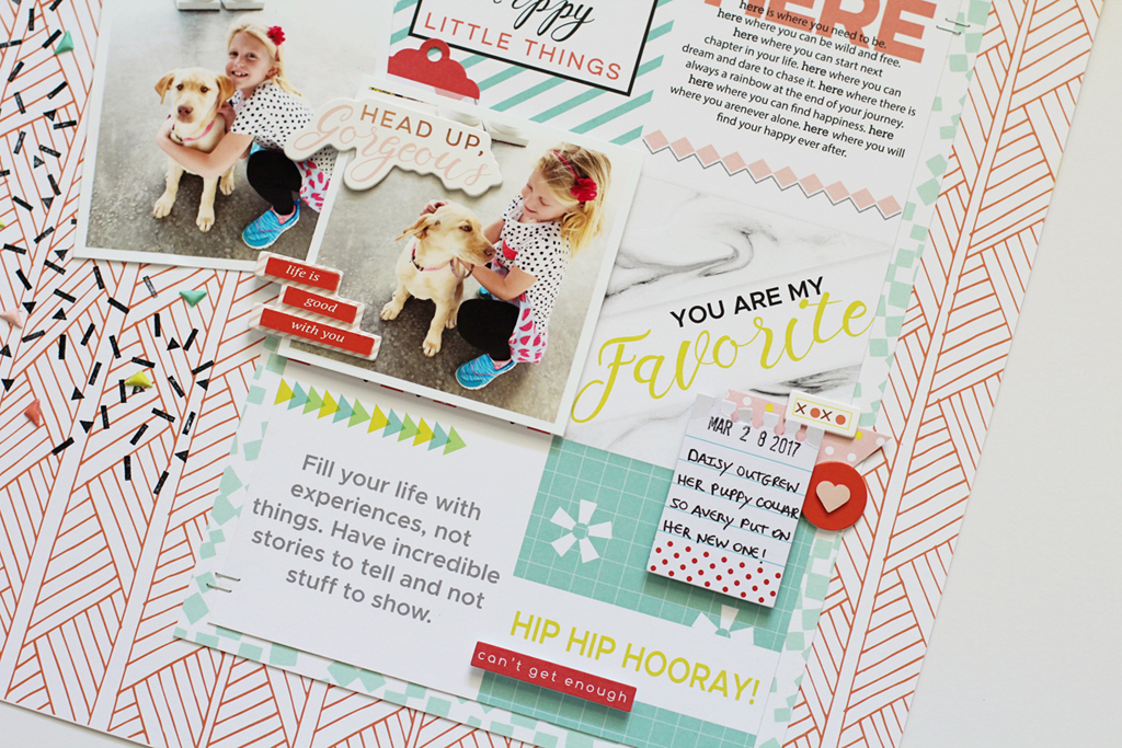
For this layout, I started by choosing one of the patterned papers from the Dream On collection and layered some smaller paper pieces from the Live More collection on top of the background patterned paper. I love the sentiments on the "Rise" patterned paper piece from the Live More collection, don't you? Since I didn't want to cover it up completely, I layered the photos of my daughter and her puppy off to the left side of the "Rise" paper so most of the wording would stay in view. I also created a little motion by stamping the confetti behind my photos using the Live More stamp set. 


For added color and dimension I placed several of the triangle shaped Studio Puffs from the Live More collection on top of the confetti stamps. I also added a few of the layered chipboard stickers from the Live More collection and The Mix No. 1 collection which is exclusively embellishments. 


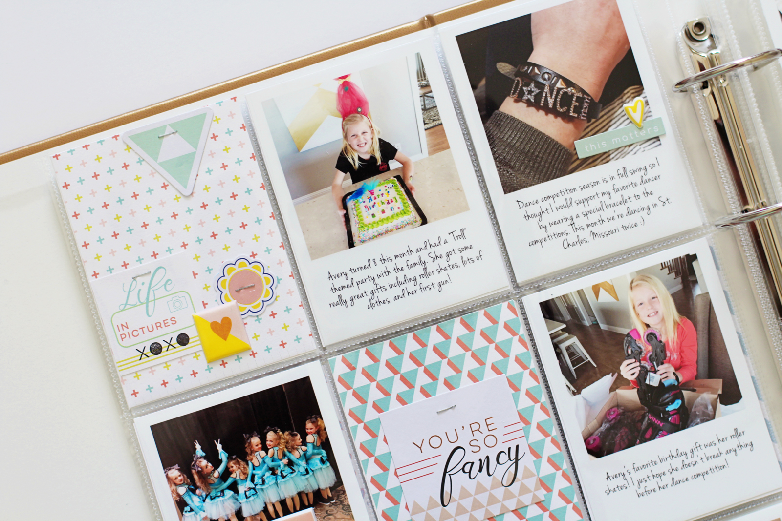
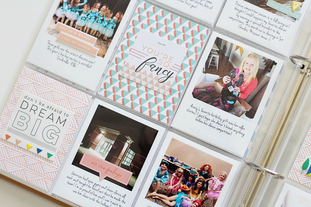
For my next project, I created a pocket page spread for my Project Life album for the month of March. After I printed my photos off on my home printer, I used the 6x6 paper pad from the Dream On and Live More collections to make my journaling cards for the 3x4 pockets. The smaller scale of the patterns look better for my overall design since the pocket sizes are smaller. I embellished directly onto my photos and the journaling cards by using items from the Dream On and Live More collections such as the studio puffs, card stock die cuts, and a few of the layered chipboard stickers. 


I kept my spread cohesive my using the same color scheme for both pages and by layering some of the embellishments onto the photos themselves. 


I created my title card, which is at the bottom right-hand corner of my spread, by simply placing some of the Live More acetate alphas on a piece of patterned paper from the same collection to spell out the month of March and adhering them using my mini stapler. 


I love how the pastel colors of the Live More collection balance out the bolder colors of the Dream On and The Mix No.1 collections! I also love how they all coordinate with my everyday photos.

Thanks so much for joining me! I hope you have a great day and don't be afraid to "mix it up"!